

Transforming a Legacy Dashboard: A User-Centric Revamp
History
For our self-serve portal for business customers, a dashboard was created 2 years ago. The features included were decided based on what the product managers thought were the customers needs. Customers were not engaged and the resulting project wasn't tested.
No customer research.. No usability testing.. No design thinking process...
The Challenge
Our customer support teams got lots of complaints about difficulty and time wastage in finding certain information within the portal. Therefore, our customer satisfaction (CSAT) scores were down.
The Goal
As a part of our AGB initiative to make our products more user-centric to decrease complaints and support calls received, enhance engagement on our business market portals, and elevate CSAT scores, we, the UX team, were tasked to work with the product team and other stakeholders to achieve this goal. As a result, we embarked on a design thinking journey...
Discovery
We Investigated: Research
Apparently, our customer needs weren't satisfied. Hence we decided to talk to customers and explore their pain points.
We selected a few of the admins who extensively use our portal on behalf of their employers, our corporate customers, and conducted qualitative interviews with them. The interviews consisted of 2 parts:
-
Questions about their daily workflow, frustrations and motivations while recording quoted answers.
-
Demonstration of their task processes while recording their behavior, comments and execution timings.
The feedback was collected and sorted into cards to create pain point clusters.

Feedback Example
Definition
We analyzed: Defining the problem
The collective users' pain points revolved around 3 main aspects:
-
Navigation complexity - It was hard to know which page lies in which navigation path, especially child pages with more than 2 hierarchical parent pages.
-
Lack of information centralization - Some data, like subscriber usage and plan overage, was distributed between billing, reporting, and usage pages. Data reconciliation was very difficult.
-
Inability of quick data glance - Users don't always have the time to dig deeper to check certain pieces of information in their distinct pages. They prefer to have a quick view in the first few minutes of their work day.
We shared our insights: Heading west with the next steps
Based on all the feedback, we created our research-driven reports and shared it with stakeholders and executive leaders. They decided that our first agile PI (phase) should include a Dashboard enhancement.
The dashboard was old, inefficient, and outdated against the other updated features inside the portal. So, we began to ideate on how to enhance it.
Project Timeline
Phase 1 was timelined and shared with all teams. The Dashboard was the most important feature and a tricky one among all. Hence, it required further research to validate its own pain points and needs.

Ideation
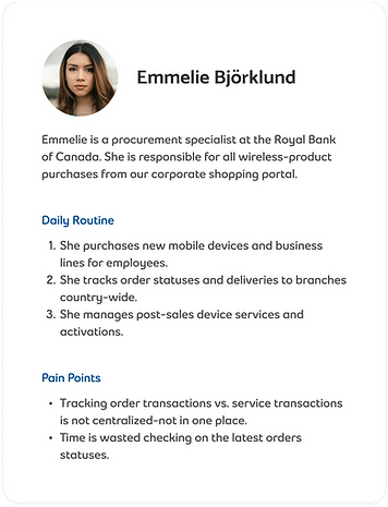
We brainstormed: Personas
We created 2 personas that encapsulated all the common pain points under the 2 main purposes of a dashboard:
-
Quick access - Access to multi-level child pages to be brought to the surface to streamline navigation.
-
Quick glance - Scattered related data to be abstractly previewed for quick reconciliation and proper deeper dive into details.

Design
Why customers still complained?: The old dashboard

The user interface was built by developers - no UX expertise involved.
The dashboard was missing key metrics that would help users with quick data glances.
Widgets/tiles didn't have the level of detail the user needed.
Features recently added to the portal didn't reflect on the dashboard
The design process
1. We started with setting up dummy blocks of what widgets we needed and the level of details in each widget...


2. With further brain storming during our design sprints, we built the wireframes/skeleton of the dashboard and its supporting features. (This is the wireframe of the final iteration)

Our final design: The jackpot


Quick glance into key metrics

Detailed and clickable usage graph

Detailed breakdown of all usage elements

Inclusive shop & orders access
Dashboard customization by showing/hiding widgets and rearranging them as fit.
Results
We iterated: Based on usability testing
We successfully achieved the satisfactory design (shown above) by testing with users and iterating the designs based on their feedback.
We got from this ..

Through this ..

Finally to this ...

What did we achieve?
Finally, our hard work resulted in:
90%
increase in customer satisfaction
80%
decrease in customer daily data tracking time
50%
decrease in complaint calls to support agents
Next steps
More features and enhancements were ideated for the dashboard and its dependencies in the upcoming phases. This project was the first increment of user-centric initiative.
